
Is staying home really going to stop COVID-19?
Published:
Disclaimer: I am not an epidemiologist. This article is not a rigorous study of COVID-19 but an intellectual exercise to explore the dynamics of a disease spreading. I recommend following the guidelines set by officials at the CDC and the NIAID.
Unless you have been rafting through the Grand Canyon for the past three weeks, you are by now intimately familiar with the COVID-19 epidemic rampaging across the world. Our new reality has brought with it a fresh set of buzzwords, like “social distancing” and “asymptomatic transmission”. In particular you hear a lot about the importance of trying to “flatten the curve”. The idea is that COVID-19 unconstrained can spread so quickly that our healthcare system can’t keep up. Slowing down the transmission of COVID-19 can prevent our medical infrastructure from being overrun. Think about this way: a hospital that can easily treat \( X \) patients a month may not be able to treat \( X \) patients a day. Here is a useful picture from The Economist:
 Source: The world gets ready, The Economist.
If that curve (representing the number of sick people at any give time) is flattened out enough, then we’ll be able to properly treat the sick. At least, that’s the goal. How does this work? We can investigate with a simple software model.
Let’s make imaginary friends and give them coronavirus
Agent-based modeling is a type of computer simulation studying the actions and interactions of a set of entities, or “agents”. In simpler words, you start by making an individual agent (for example, a car) that follows a set of simple rules (follow the speed limit, brake within a certain distance of other cars, etc.). Then you simulate a whole bunch of these agents in the same environment. The interesting part is that when these uncomplicated individual agents interact with each other, complex behavior emerges (like traffic patterns)! This approach is often used to study the spread of diseases like COVID-19.
Note: as I was putting this post together, I found an excellent article in the Washington Post in which the author also uses agent-based modeling to study coronavirus. I recommend reading it.
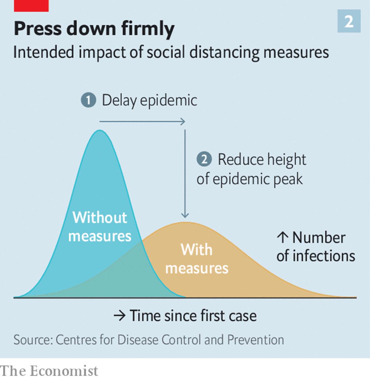
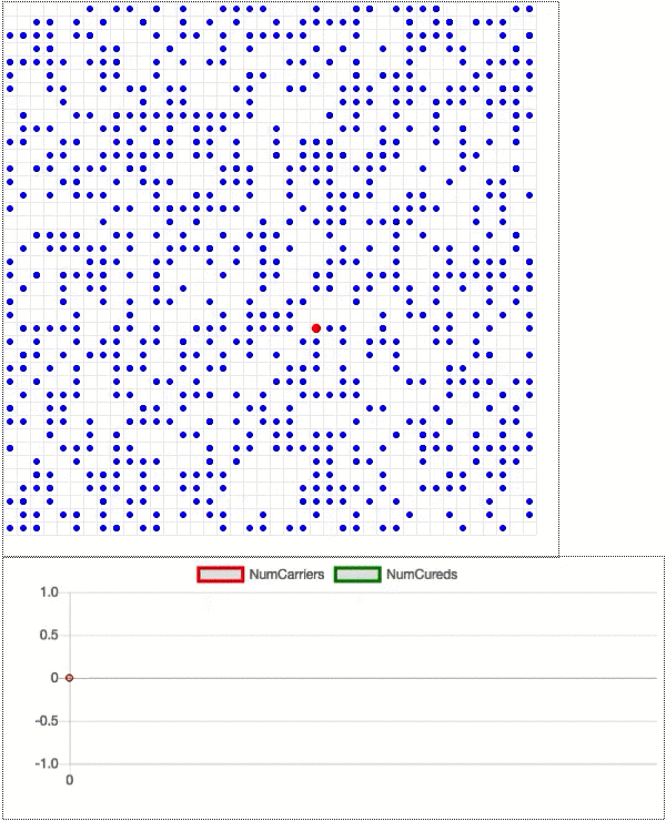
Here is a basic example. Just two agents, as shown by the two dots, sitting on a two-dimensional grid. The model evolves in discrete time steps, and in each step an agent can move in a random direction and interact with other agents in the same cell of the grid. The GIF below starts with one blue dot that represents a normal, healthy person, and one red one that is carrying the COVID-19 virus. You might need to wait a moment for the GIF to loop back to the start.
The dots each move once per step in a random direction, and when they share the same cell they interact. Almost like they are shaking hands with each other and talking about this weather we’ve been having. This gives a chance for the COVID-19 dot to pass the virus along to the healthy dot. Then both dots go about their merry lives until they get over the disease and become cured (green). Note that we do not consider deaths that hypothetically would result from oversubscribed hospitals. The length of the disease is set to 14 days-corresponding to the typical duraction of COVID-19 in the real world-where each model step counts as a day. We assume here that once somebody gets COVID-19 and is cured of it, they are immune to getting it again.
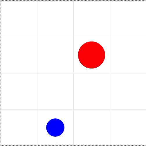
Now let’s add some more dots. Say, 1000 total, with 999 healthy dots (blue) and one disease carrier (red). See the GIF below. The carrier quickly infects its neighbors to create an ever-growing cluster of red, and almost all the dots are infected at one point in time or another. The infected dots either become green to indicate that they are cured, or they die and disappear from the grid. Below the grid is a chart showing how the number of disease carriers (red line) and the number of cured people (green line) changes over time.
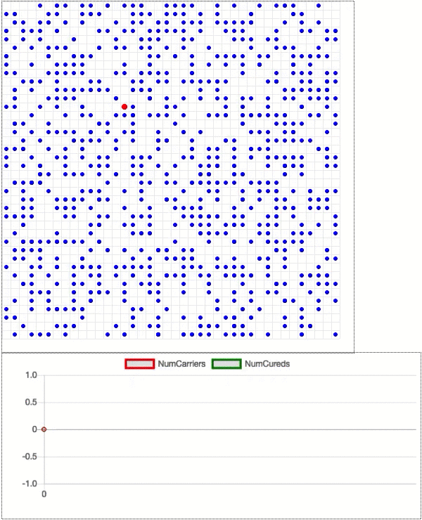
The disease spreads until the number of carriers reaches a maximum (about half the population) at 45 days in. Then that number drops as the disease starts fading away. The green line continues to rise until it flattens out at almost the entire population. The red line is the curve that we are trying to “flatten”: imagine Dot General Hospital can only accommodate 100 sick dots at a time. Can social distancing really keep the number of disease carriers under control? Let’s see.
Suppose we run a new, identical simulation except that 80% of the dots start social distancing on day 20. That is, they stay still rather than move around on the grid. That number is only 80% because there are always essential services (doctors, grocery store employees, sanitation workers, etc.) that need to stay active, and because some people ignore the policy.
The social distancing begins as the infection rate is still rising, but well before the number of sick dots reaches half of the population (as seen above). The impact is immediate. Less motion means fewer interactions which means a significantly slower infection rate. The point of maximum infection now happens at about 20% of the total population. Social distancing flattens the curve in a major way.
What about social distancing for the sick?
“Yes, okay, whatever”, I hear you saying, “but I’m not sick! Why should I care?”. Well, reader, there are two reasons. First, most cases of COVID-19 present asymptomatically. Although you probably aren’t infected right now, you could be. And even if you feel great, you could pass on the disease to a family member, coworker, or passerby. Second, COVID-19 has an incubation period of several days. That means that if you contract COVID-19, you can spread it to other people for days afterwards before your symptoms even present. Even if every single noticeably sick person practiced social distancing, there is still an ample window for the disease to spread.
We can actually add this in to our model. For each dot that gets infected, let’s assume that it takes at least 5 days for symptoms to present. Once that happens, the dot remains stationary. In other words, this is an “ideal” world during which obviously sick people stay inside while the rest of the population lives life as normal. Here is a simulation of what that looks like.
Not great. In fact, the peak is as high as when we don’t social distance at all! Apparently the five-day incubation period is long enough for the virus to move through the population unfettered. Intuitively this makes sense: a freshly infected person is likely to be surrounded by healthy and non-social-distancing dots that represent prime real estate for COVID-19.
One caveat to the above discussion is that we only looked at one simulation trial for each case. The dots move randomly, so in principle the simulations could be completely different if we reran the models. The way to validate these results is to run all the simulations 1000 times each. Below is a chart showing 1000 simulated infection curves for different social distancing scenarios. Blue is no social distancing; red is social distancing from day 20; cyan is social distancing from day 10; and black is social distancing for only symptomatic carriers.
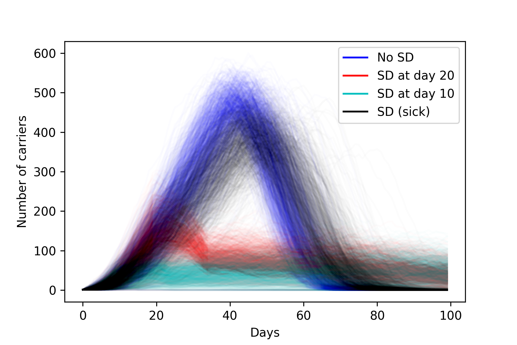
As expected there is variation for each different color, but we can clearly make some conclusions. The blue and the black overlap significantly, indicating that the “social distancing for the sick” policy does not work. On the other hand, a more global distancing plan makes a major impact when starting at day 20, and even moreso at day 10. And interestingly, the black and blue curves go to 0 much more quickly than the red and cyan (which are still going even after day 100, where the plot cuts off). In the latter cases, the virus slowly burns through the population, and is still able to find dots that haven’t been infected at day 100 and beyond. We really are flattening the curve.
Another way to visualize this data is to only consider the peak of each infection curve (after all, our main goal is to lower this value). For each simulation, we get the maximum number of carriers from the infection curve, and put it into a histogram. Note that in addition to the previously discussed scenarios, the plot below also shows the results of social distancing from day 40. As you can see, starting too late is almost as bad as doing nothing at all.
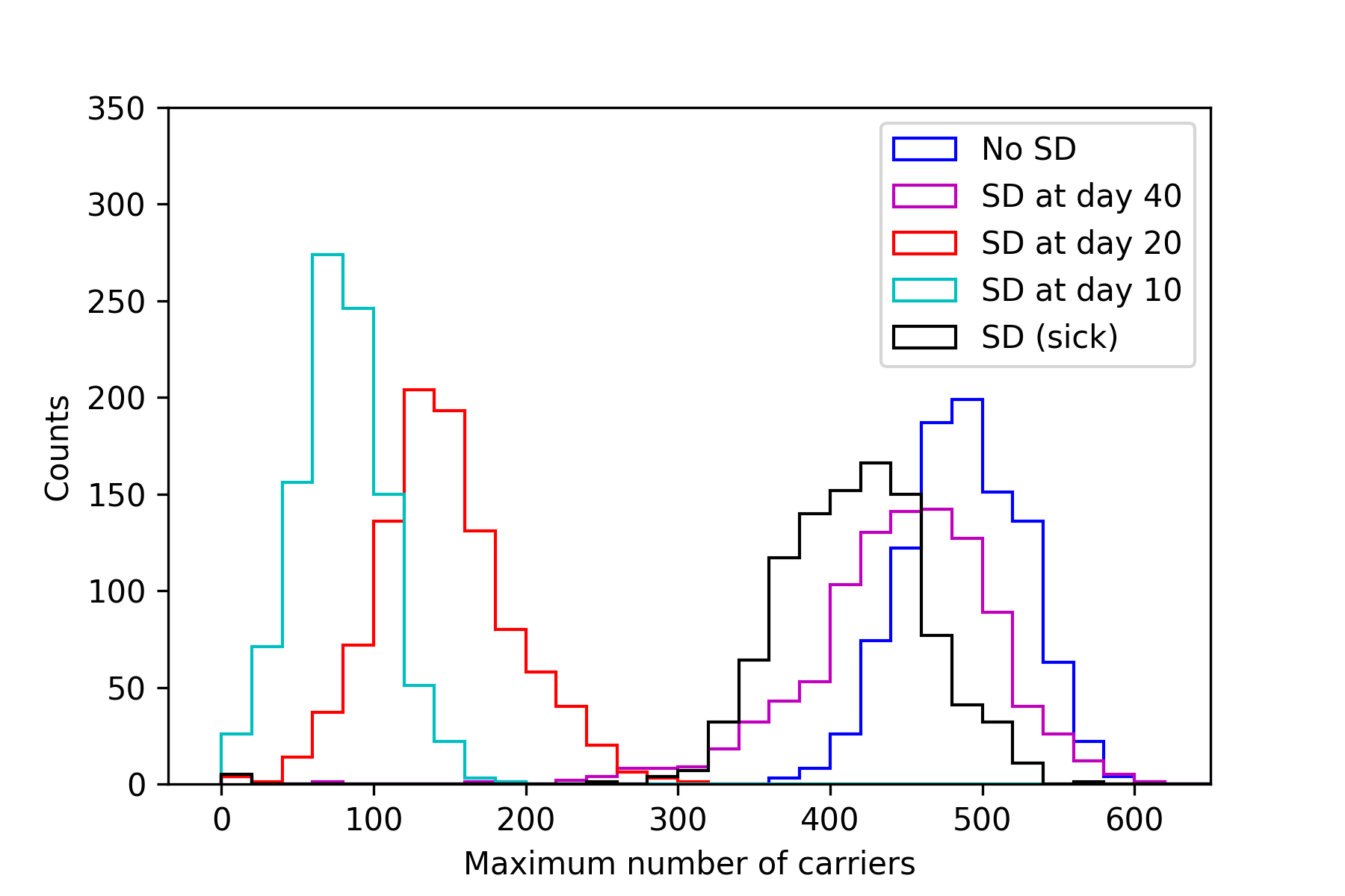
The results are conclusive. Broad and prompt social distancing drastically slows down the spread of the disease. Because of its incubation period and sometimes asympomatic presentation, COVID-19 is not slowed down by selective social distancing limited to the sick.
This is just a toy model and the quantitative results are purely theoretical. Still, agent-based modeling is useful for studying the dynamics of an epidemic, and it shows that COVID-19 can spread even when people who feel sick practice social distancing. So stay home, even if you feel healthy.
“What’s true of all the evils in the world is true of plague as well. It helps men to rise above themselves.”
Albert Camus, The Plague
Technical Details
Code used for gathering data, analysis, and plot generation can be found here. The agent-based modeling (ABM) is done with Mesa, which for the most part worked fine. It did not scale well to large batch runs, and I wish there was an easy way to set an end condition (e.g. end the simulation when there are no more carriers left). Still, it is straightforward to use and the visualization works well. I recommend it if you want to play around with ABM.
There are some paramaters in the code which are in principle tunable. The disease lasts for a fixed length of 14 days. The infection rate is 100%. Despite the fact that this number is unrealistic, I set it to 100% for three reasons: 1) in real life, a person can get the virus not just by interacting with another person, but with an inanimate object (e.g. using the same door knob that a sick person did), 2) these dots have fewer average interactions per day than a typical working person, and 3) there was no good value for this in any studies that I read. The probability that a dot dies on a given step is 0.22%. I set this value so that over the course of a 14-day illnesss roughly 3% of the dots end up dead, since this is about what the overall case fatality rate is expected to be for COVID-19. So with \( (1 - p)^{14} = 0.97 \) where \( p \) is the probability that a dot dies on a given step, then p comes out to be 0.22%.
Each simulation starts with one randomly placed carrier dot amid a population of healthy ones. For each step of the model, each (living) dot moves in a random direction, unless they are social distancing. If the dot is a carrier, it interacts with all the other dots in the same cell, and potentially infects them. Lastly we check to see if the dot dies, and if not then increment the sick day counter. After 14 days, the dot becomes cured and is no longer a carrier. The dots act in a random order that changes with each step. The visualizations above only show the conclusion of a given step, so it may look like the disease passes between two dots that never shared a cell. In fact, they did share a cell for part of a turn, before one of them moved away.
I used Jupyter Notebooks to run batches and generate figures. I have reservations about Jupyter Notebooks (read more here) but they can be a helpful tool as long as one is aware of the limitations. To make the gifs, I screen-captured the web-based visualization and then threw them into PicGIF Lite.
There are many ways this model could be improved and expanded. A South-Korea-style test and trace approach would be straight forward to implement. Also, the flattening of the curve introduces a new problem in that the disease lingers for much longer: is broad social distancing economically sustainable for more than several weeks? What happens if there were, say, three weeks of broad distancing and then a targeted approach after that? And of course a study of the true death toll might be interesting. In the above simulations, only a small fraction of people die because the mortality of COVID-19 is about 3%. But the number of dead could skyrocket (from all causes) if hospitals fill up.