
Ax those lax tax axes
Published:
Last week, the New York Times published an Op-Ed by David Leonhardt about how tax rates in America have changed over the past 70 years. The piece is based on recent work by the economists Emmanuel Saez and Gabriel Zucman, who argue that total taxes paid by the wealthiest Americans have dropped substantially since 1950.
Whether or not that claim is true is not my concern today. I want to talk about the choices the NYT made in presenting the Saez-Zucman tax data.
The article is centered around a slick visualization of what Leonhardt calls the “total tax rate” for different income levels. As you scroll downwards, data from different years shows up on the plot while the previous years fade to grey and remain visible. Here is a screenshot of where we end up after scrolling all the way:
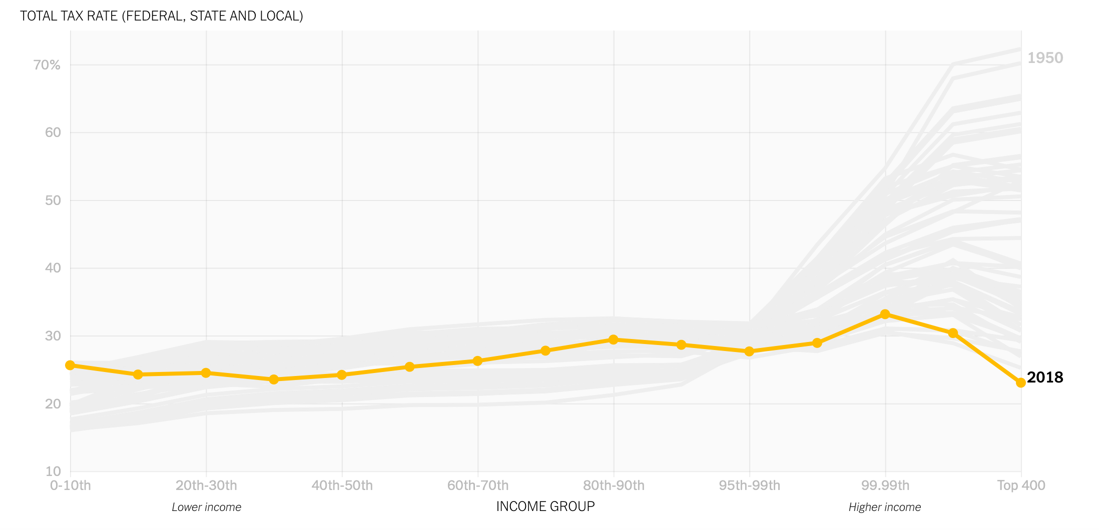 Source: The Rich Really Do Pay Lower Taxes Than You, David Leonhardt, New York Times.
Leonhardt’s thesis is that the tax rates on the super wealthy have dropped consistently since 1950, resulting in a relatively flat “total tax rate” for all income levels. But rather than supporting this claim, the presentation of the data undermines it. The two reasons why are both fundamental:
1) The quantities being plotted are not all clearly defined.
Leonhardt says that the total tax rate is a quantity “spanning federal, state and local taxes”. This is already ambiguous, and a missed opportunity for Leonhardt to spell out exactly what he is showing us. A closer look at the text shows that several references are made to all sorts of different taxes including income, property, payroll, estate, etc. Okay, so it looks like the total tax rate includes the rates from many tax varieties.
But…what does that mean? Is this tax rate the percentage of income actually paid in tax, or is it just a nominal rate calculated from some spreadsheets of marginal rates? Does it take into account loopholes and deductions? Where does the data for the top 400 earners come from for the years before 1992 (which is the earliest year I can find that the IRS makes that data available)? Does Leonhardt expect me to believe that the top 400 earners in 1950 paid 70% of their incomes in tax? To be clear, that very well may be true. I don’t know! I’m not an expert, I’m just a man from the 21st century who is not used to those mind boggling numbers. That is exactly why it is so important for Leonhardt to be crystal clear.
Frankly, it is hard to know what the plot is saying if you don’t know what it’s showing. If you Google “total tax rate”, then the first thing to come up is…this article. Next are a bunch of income tax calculators, which we have already established is not what total tax rate refers to. The term itself seems to not have an established popular usage. Maybe the definition is buried in a textbook somewhere and would be quickly understood by an economics student, but the responsibility here is on the NYT to know their audience and to be unambiguous in describing what is being plotted.
Anyway, let’s set aside this problem for a moment. For now, give Leonhardt the benefit of the doubt that “total tax rate” means taxes paid as a percentage of income.
2) The axes are misleading.
The first time I looked at the figure above, my takeaway was that taxes have dropped significantly for the top 15-20% of earners in the United States. That’s the approximate portion of the x-axis over which taxes drop since 1950. Only after looking at the small and light grey x-axis labels did I realize that I had been misled! The equidistant grid lines and points imply that the x-axis is a linear scale, meaning that moving from left to right along the axis represents a proportional increase in the income group. But this is not at all the case. Despite those points being equally sized and spaced, some of them, in fact, represent 10% of the population and others represent far less than that (even down to 400 individual people).
This may sound pedantic, but it’s a critical flaw in this plot because it dishonestly represents the data. Aside from the fact that this is an immoral thing to do, this mistake invites readers to incorrectly understand what the data show. Take for example somebody in the top 15-20% of incomes glancing over this article. This person is in the demographic that Leonhardt wants to communicate to, since she is not among the super rich and therefore may be more amenable to the position that the super rich don’t pay as much in tax as they used to. But because of the terrible axes, she might take away the message that taxes at her income level have been dropping to historical lows. Now that person may be more resistant to Zucman-Saez-Warren type tax reform, which achieves the exact opposite of Leonhardt’s goal. On top of that, when I see such a lazy and misleading visualization, now I am more likely to be skeptical of other claims made based on this data, because I now suspect the authors of being dishonest. Again, this actively works against the goal of the Op-Ed.
And that is not all: the y axis is zoomed in to go from 10% to 75%, rather than from 0% to 100%, which would more clearly show the relative scale of tax rate changes. At a quick glance, it looks like in 1950 the wealthiest people paid 10 times as much in tax as the poorest. In reality, the numbers show that they paid about 4 times more.
I plotted their data for a sample of years and showed what it looks like on normal axes. Here is a gif that loops through six years from 1950 to 2018.
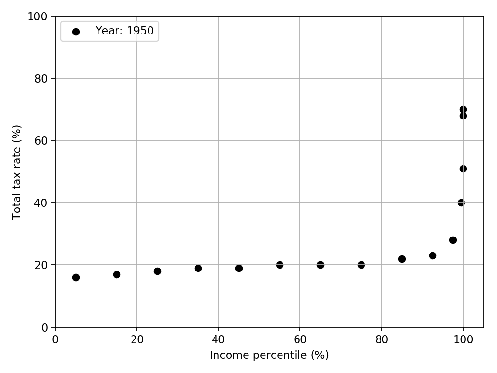
The story is now clear that the tax burden of the very top of the income distribution (the top 1% or so) has plummeted, while everybody else’s (all the way up to the 5%ers) seems to have risen slightly. To show in more detail what is happening at 99%, 99.9%, etc., one can either do another plot that is zoomed in on that region, or use a logarithmic scale.
Presenting data is hard
A few days later, there was another NYT Op-Ed written by Saez and Zucman themselves. Take a look at the bar graphs they present. The authors break down “total tax rate” (and describe it explicitly in the text) to show exactly what they include in this quantity. Axes are clearly defined in a non-misleading way. Overall, a significant improvement over the previous Op-Ed.
Of course, the bar graphs don’t present how any of these rates vary as a function of time. Nobody said this was easy! Good data visualization reveals what the data is saying without trying to speak on behalf of the data. I would much rather see a less ambitious graphic that follows this principle, than a more ambitious graphic that doesn’t.
Technical Details
Code used for gathering data, analysis, and plot generation can be found here. Mostly standard matplotlib. I used FuncAnimation from matplotlib.animation for the first time. I found this introduction useful for learning it. To get the tax rate data, I used WebPlotDigitizer.